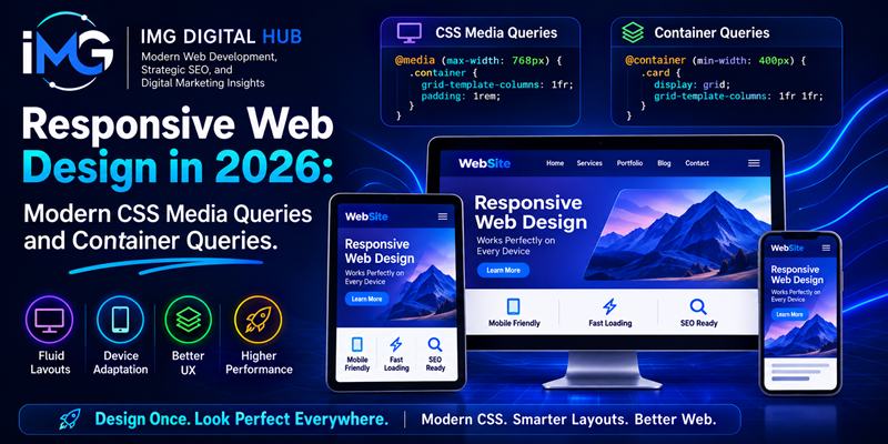
Responsive Web Design in 2026: Modern CSS Media Queries and Container Queries – Web design has transformed how front-end engineers build modern digital interfaces. Years ago, Ethan Marcotte introduced responsive design using fluid grids and flexible images. However, modern web interfaces must operate across an unprecedented variety of screen dimensions, foldable devices, and dynamic viewports.
Responsive Web Design in 2026: Modern CSS Media Queries and Container Queries
In the past, traditional responsive strategies relied exclusively on browser viewport dimensions. Nevertheless, modern web architecture demands modular flexibility. As a result, the web development ecosystem in 2026 relies on a powerful dual approach. Specifically, developers combine global viewport adaptation via modern CSS media queries with local component adaptation via CSS container queries. Therefore, this guide explores how front-end developers leverage both technologies to craft resilient, component-driven web applications.
The Evolution of Media Queries: Range Syntax and User Preferences
Media queries remain the foundational bedrock of global layout adaptation. Furthermore, modern CSS specifications have introduced syntax enhancements that streamline stylesheet architecture.
Simplified Range Syntax for Viewport Queries
Historically, developers wrote verbose media query statements using min-width and max-width feature queries. However, modern CSS media queries feature intuitive comparison operators that improve readability and reduce syntax errors.
CSS
/* Legacy Media Query Syntax */
@media (min-width: 768px) and (max-width: 1024px) {
  .sidebar { display: block; }
}

/* Modern Range Syntax */
@media (768px <= width <= 1024px) {
  .sidebar { display: block; }
}
As shown above, this mathematical range syntax allows developers to write precise breakpoint conditionals effortlessly. In addition, cleaner code reduces maintenance overhead across complex stylesheets.
User Preference Media Features
In addition to screen dimensions, modern responsive design adapts to user environments directly. Specifically, specialized feature queries detect user operating system preferences:
-
prefers-color-scheme: Enables automatic switching between dark and light UI themes based on user settings. -
prefers-reduced-motion: Disables high-intensity CSS animations for users susceptible to motion sickness. -
prefers-contrast: Adjusts color contrast ratios for individuals requiring enhanced visual clarity. Consequently, web pages become more inclusive.
Understanding CSS Container Queries: Component-Based Responsiveness
While media queries effectively control global page architecture, they present inherent limitations for reusable component design. For instance, a card element placed inside a narrow sidebar often requires different styling than the exact same card placed inside a wide main content column. If developers rely solely on viewport media queries, they are forced to write brittle, context-dependent utility classes.
To solve this problem, CSS container queries allow elements to respond directly to the dimensions of their parent container. Consequently, component styling remains independent of the global browser viewport. Implementing Clean JavaScript Architecture for Scalable Web Applications
Defining Containers and Container Syntax
To implement container queries, developers must first declare an element as a containment context using the container-type property.
CSS
/* Step 1: Establish Containment Context */
.card-wrapper {
  container-type: inline-size;
  container-name: card-container;
}

/* Step 2: Apply Component Styles Based on Container Width */
@container card-container (min-width: 400px) {
  .card {
    display: flex;
    flex-direction: row;
    gap: 1.5rem;
  }
}
In this code example, the .card component transitions smoothly from a stacked vertical layout to a horizontal row layout. Furthermore, this transition occurs whenever its parent wrapper exceeds 400 pixels in width. As a result, the component remains completely self-contained and highly versatile.
Comparing Media Queries and Container Queries
To choose the correct tool, understanding when to apply media queries versus container queries is essential. Below, a comparative breakdown illustrates their primary architectural differences.
| Feature | Media Queries | Container Queries |
| Query Target | Browser Viewport / Screen | Immediate Parent Container |
| Primary Use Case | Macro-Layout (Header, Grid, Footer) | Micro-Layout (Cards, Widgets, Forms) |
| Component Reusability | Low (Tied to Page Viewport) | High (Context-Independent) |
| Styling Context | Global Page Structure | Local Component Boundaries |
On one hand, front-end architects should utilize media queries to manage macro-structural elements, such as multi-column page grids and global navigation bars. On the other hand, developers should deploy container queries for self-contained UI components that re-align based on available parent container space.
Best Practices for Combining Modern CSS Features in 2026
Achieving optimal performance and maintainability requires orchestrating modern CSS tools strategically. Therefore, developers should follow these recommended best practices:
-
Adopt Fluid Typography with
clamp(): Combine container queries with modern CSS math functions likeclamp(1rem, 2.5vw, 2rem). Consequently, font sizes and padding scale fluidly without requiring excessive media query breakpoints. -
Utilize Container Query Units: Modern CSS provides dedicated container query length units (
cqw,cqh,cqi). For example, usingcqiallows element padding and font sizes to adjust dynamically relative to parent container dimensions. https://imgdigital.co.za/web-development/implementing-clean-javascript-architecture-for-scalable-web-applications/ -
Keep Macro and Micro Responsiveness Separate: Maintain a strict separation of concerns within your stylesheets. Specifically, reserve media queries for high-level document layout frames and delegate individual component layout logic entirely to container queries. As a result, stylesheets remain clean and maintainable.
Summary
In conclusion, responsive web design in 2026 represents a major shift from rigid page-level breakpoints toward fluid, component-driven responsiveness. By combining modern CSS media query range syntax with localized container queries, developers build highly adaptable user interfaces. Ultimately, mastering these modern CSS layout features ensures your web applications remain scalable, accessible, and resilient across any digital device ecosystem.