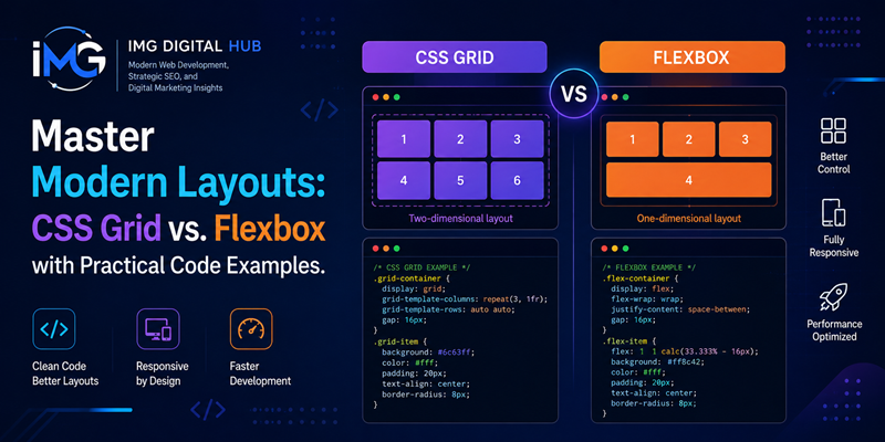
Master Modern Layouts: CSS Grid vs. Flexbox with Practical Code Examples – For years, front-end developers struggled to create flexible, responsive page layouts using CSS floats, clearfixes, and positioning hacks. Fortunately, modern CSS specifications revolutionized web layout design by introducing CSS Flexible Box Layout (Flexbox) and CSS Grid Layout (Grid).
Master Modern Layouts: CSS Grid vs. Flexbox with Practical Code Examples
While both layout modules eliminated historic design workarounds, developers often debate which tool to select for specific user interface components. Understanding the fundamental architectural differences between CSS Grid and Flexbox allows engineers to write cleaner, more maintainable stylesheets. This guide explores both CSS modules, provides practical code examples, and demonstrates how to combine them effectively.
Core Conceptual Differences: 1D vs. 2D Layouts
The primary distinction between Flexbox and CSS Grid lies in their dimensional alignment. Consequently, it arranges items along a single axis, either horizontally in a row or vertically in a column. Flexbox works exceptionally well when distributing space among a set of elements along one direction.
Conversely, CSS Grid operates as a two-dimensional layout system. Grid allows developers to place elements precisely inside an explicit structural matrix.
To summarize their core philosophies: Flexbox is content-first, meaning the size of the content dictates the container structure. CSS Grid is layout-first, meaning the predefined grid container dictates the placement of the internal content.
Master CSS Flexbox: Principles and Code Example
Flexbox excels at aligning UI components and building micro-layouts. When you apply display: flex to a container element, its immediate child elements instantly become flex items.
Consider a standard website header where a logo, navigation links, and a call-to-action button must distribute evenly. Flexbox accomplishes this layout effortlessly with minimal CSS.
CSS
/* Flexible Navigation Bar */
.navbar-container {
  display: flex;
  justify-content: space-between;
  align-items: center;
  padding: 1rem 2rem;
  background-color: #0f172a;
}

.nav-menu {
  display: flex;
  gap: 1.5rem;
  list-style: none;
}
In this code example, justify-content: space-between pushes the branding logo to the far left and the menu items to the right. Additionally, align-items: center aligns all navigation elements along the vertical cross-axis.
Primary use cases for CSS Flexbox include:
-
Aligning items vertically or horizontally within a container.
-
Creating responsive navigation bars and toolbars.
-
Equalizing heights across adjacent card components.
Master CSS Grid: Principles and Code Example
While Flexbox manages single-axis items, CSS Grid structures two-dimensional page layouts. Grid enables developers to define explicit column tracks, row heights, and structural gaps using modern units like the fr (fractional) unit.
For instance, constructing a responsive three-column product catalog requires very little code when utilizing CSS Grid alongside the minmax() and auto-fit functions.
CSS
/* Responsive Card Grid */
.product-grid {
  display: grid;
  grid-template-columns: repeat(auto-fit, minmax(280px, 1fr));
  gap: 1.5rem;
  padding: 2rem;
}

.product-card {
  background-color: #ffffff;
  padding: 1.5rem;
  border-radius: 8px;
}
In this snippet, repeat(auto-fit, minmax(280px, 1fr)) creates a fully responsive layout automatically. Grid items reflow to the next line when screen widths shrink, eliminating the need for media queries.
Primary use cases for CSS Grid include:
-
Designing overall webpage structural frames (headers, sidebars, main content, footers).
-
Constructing image galleries with varying tile dimensions.
-
Building multi-column dashboard interfaces.
Combining CSS Grid and Flexbox in Modern Web Architecture
Selecting between CSS Grid and Flexbox is rarely an exclusive choice. In modern front-end engineering, robust digital interfaces combine both modules harmoniously.
A recommended architectural strategy utilizes CSS Grid for the macro-layout and Flexbox for micro-layouts. For example, developers can employ CSS Grid to structure a page layout or product grid. Inside individual grid items, developers can use Flexbox to align titles, text descriptions, and action buttons vertically.
CSS
/* Macro Layout using CSS Grid */
.catalog-section {
  display: grid;
  grid-template-columns: repeat(3, 1fr);
  gap: 2rem;
}

/* Micro Layout using Flexbox inside each card */
.catalog-item {
  display: flex;
  flex-direction: column;
  justify-content: space-between;
}
This hybrid approach leverages the explicit structural control of CSS Grid alongside the fluid content alignment of Flexbox. Consequently, web stylesheets remain modular, scalable, and easy to maintain over time.
Summary
Mastering modern web layouts requires choosing the appropriate CSS tool for each specific UI challenge. Use Flexbox when organizing components along a single horizontal or vertical axis, such as navigation menus or form controls. Use CSS Grid when engineering complex two-dimensional structures, such as entire page frames or photo galleries. By combining CSS Grid and Flexbox strategically, developers can build performant, responsive web applications for modern browsers.